

This example shows how the results of the optimization can be converted to a simulation scenario to analyze the performance of the supply chain at any moment using the Simulation experiment. It also shows how to calculate the safety stock using the Safety Stock Estimation experiment.
The actual scenario data can differ from this description if you are using the PLE version.
This scenario was created by converting the results of the NO scenario to a SIM scenario. The scenario is a part of the sequence of 4 example models that illustrate the different stages of supply chain analysis:
- GFA US Distribution Network — a scenario for finding locations for warehouses.
- NO US Distribution Network — a scenario for selecting facilities from the suggested list of distribution centers and ports.
- SIM Distribution Network Analysis — a scenario for running simulation based on the result of the optimization converted to the SIM scenario to analyze the network suggested at the NO stage in more detail. This is the scenario we will investigate now.
- SIM Budget Comparison — a scenario for analyzing the impact of unstable demand on the service level of the supply chain.
All input data can be found in previous examples of this sequence.
In the previous step we used the NO experiment to find the most suitable port and warehouse locations in every area: DC Lynchburg, DC Reno, DC Austin, Port of New Orleans.
The result of the optimization experiment is often converted to the SIM scenario to check supply chain performance in dynamics by analyzing statistics.
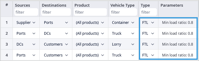
In addition to the data we had after converting NO results to SIM, we defined 3 vehicle types to make the supply chain more realistic. The products are now delivered from the Supplier to the Port by Containers. We set the Truck vehicle type for the path from the port to distribution centers. From the warehouses to the customers the products will be delivered by the Lorry.
We also set the shipping type to FTL with a Min load ratio of 0,8 between all objects.
Finally, we rounded the values in the Inventory table to operate in integers
Run the Simulation experiment and analyze how the results of network optimization work in dynamics.
A simulation experiment is used to model the actual product delivery on the map, and with detailed statistics, which collect corresponding data during the experiment from different types of facilities involved in the supply chain scenario.
On the dashboard, we can see some predefined statistics. These statistics are grouped by their type in different tabs.
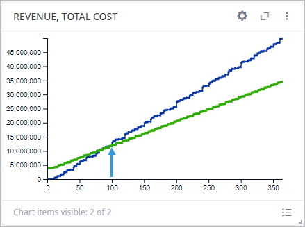
In the Profit and Loss Statement tab, we can see the aggregated financial statistics of the supply chain. The Revenue, and the Total cost chart show how revenue and total cost increases throughout the simulation. In the chart, we can see that starting from the 100th day of simulation the company starts to gain profit (revenue becomes more than total cost).
The aggregated service level statistics were collected using different methods in the Service Level tab. There are two main ways of calculating the service level used. In the first case it is calculated based on the expected lead time (ELT Service Level). In the second case it uses the actual amount of products or orders available (Service Level by Products). We can see here that the service level is below 1 on every chart. Since there are different calculating methods, there are also different reasons for these low values.
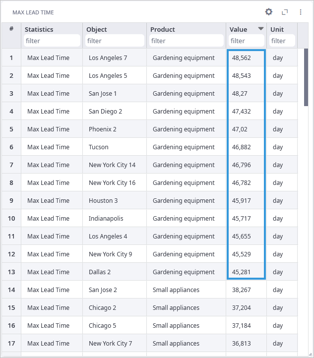
The ELT Service level relates to the lead time, so let us observe this tab. We can see, that while the mean value of the lead time is below 30 days (it is the default value defined in the Demand table), there are several cases of lead time exceeding even 40 days. That is why ELT Service level is not perfect for these customers. That big lead time is caused by the FTL shipping type. The shipping of the order now starts only if the order a customer placed occupies 80% of the vehicle's max capacity.
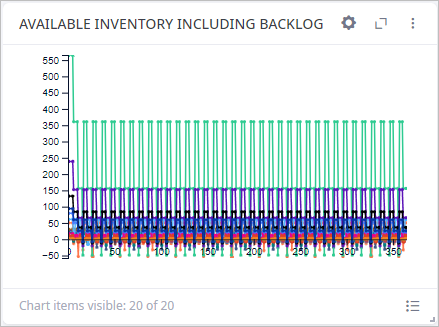
As for the regular Service Level, it is based on the availability of the products. So, we can observe the Available Inventory tab to understand the reason for the decrease in service level. In the Available Inventory Including Backlog chart, we can see that during simulation level of available inventory drops below 0 for almost all distribution centers and products. This means that the warehouses lacked products to deliver. Which results in decrease of the service level.
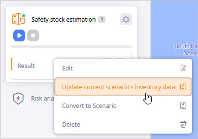
This happened because we did not consider safety stock while defining inventory policies. The easiest way of doing this is running the Safety Stock Estimation experiment with this scenario and then updating the scenario’s inventory data with the results of the experiment.
Now, if we run the Simulation experiment again, we will see that all charts of non-ELT Service levels become much better.
You can further observe other tabs as well as create new tabs or simply add the required statistics to the dashboard.
The next step is the SIM Budget Comparison example, where we analyze the impact of unstable demand on the service level of the supply chain.
-
How can we improve this article?
-